Squarespace for Busy Founders: How Do You Use Content Blocks?
Being a founder can be overwhelming. Coming from a day job, you suddenly realize just how much of the work depends solely on you as a founder: no bosses for guidance or colleagues for help. There’s so much to do, so much to learn, so little time.
This is why we created this series of blog posts. Squarespace for Busy Founders is Designstaq’s Beginner Series for the time-poor. Getting your website up is important, but getting your business to actually run? Even more so. Our guide cuts through the clutter so you can build your own Squarespace site simply and effectively.
If you haven’t already yet, check out our two previous posts here and here to get an introduction to Squarespace and its Pages. Good to know before you read on for today’s material: how to actually add Content to said Pages.
HOW TO ADD CONTENT TO A PAGE
Let’s assume you’re on your Pages Panel and you’ve created a new Page by clicking the plus (+) sign beside Main Navigation. (Don’t know how? Check this illustration out from our previous post.) After clicking, your screen should look something like this:
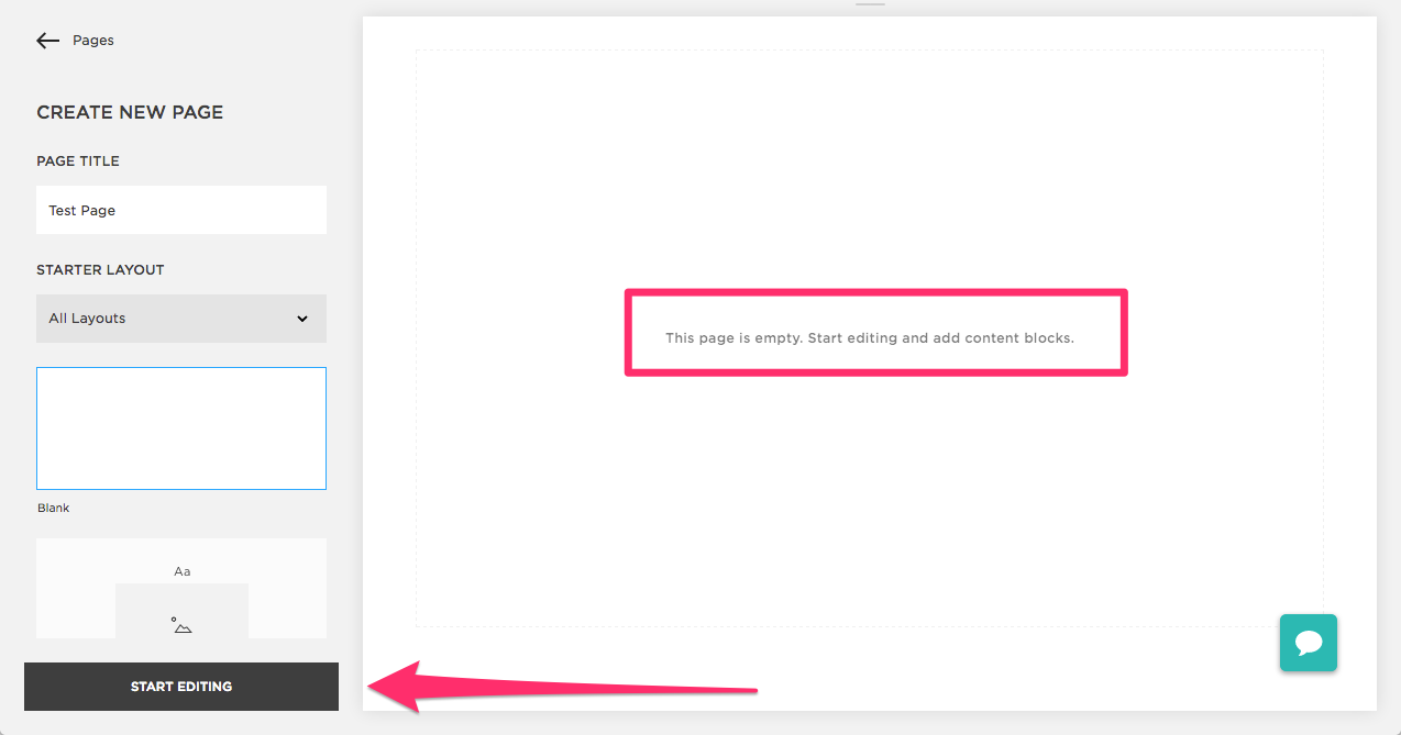
Put “Test Page” as your Page Title. Next, notice the text inside the pink box: “This page is empty. Start editing and add content blocks.” As we’ve established, Squarespace is very self-explanatory. Click the box pointed by the arrow to Start Editing – this enables us to start adding our Content Blocks, just like how the text told us to.
But before we do that, just what are Content Blocks, exactly? And how do we use them?
CONTENT BLOCKS: WHAT THEY ARE AND WHICH ONES TO USE
If you’ve read our first post, then you should know the difference between Content and Style by now. Content is the meat of your website and Style is how to make sure it looks good.
Content Blocks, therefore, are simply blocks of your chosen content (text, images, etc.) that you can add or remove from your Page at any time. The reason they’re placed as blocks is for you to have an easy time laying them out.
Go ahead and click Add (Content) Block on your upper right:

A menu with the different types of Content you can place on a Page should pop up, like so:

Try scrolling through it. A bit overwhelming, right? Who knew there’d be so many types of Content Blocks?
Don’t worry, we’ve got you covered. Read on below for the most frequently used Content Blocks, arranged from most to least. Recommendations and illustrations follow, too.
1. TEXT
What It’s For: Add text to your site, including headings, pre-formatted text, links, and lists.
Our Recommendation: Use this when you want to add a short paragraph expressing more information; as a title on a Page; or anywhere you want to use words instead of images.

Notice how there’s a faint gray box surrounding your Content as you hover over it – this is why it’s called a Block. You’ll even see which type it is – just follow the pink arrow above. This is applicable to all Content Blocks you’ll encounter.
Here’s a link to our Home Page if you want to see the finished product – you’ll need it for the next two examples too.
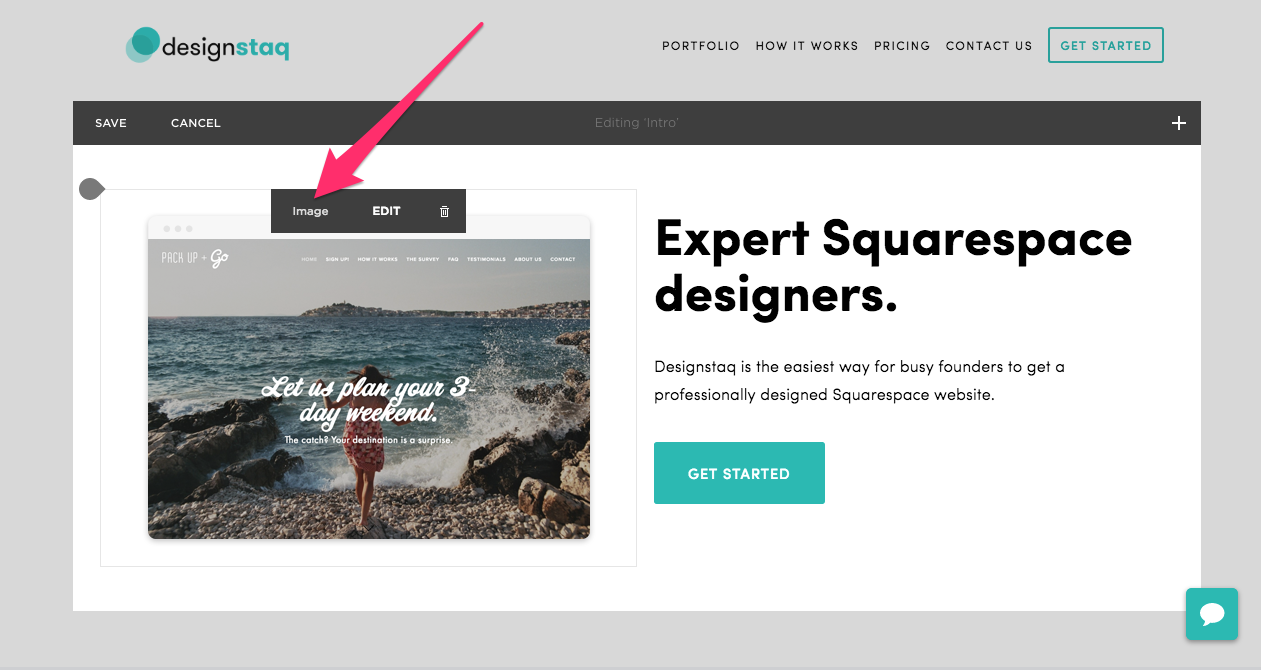
2. IMAGE
What It’s For: Add a single image to your site (usually .jpg or .png).
Our Recommendation: Using a single image is a great way to grab attention at the start of a Page or even a particular section you want to highlight. (Just make sure its resolution is high!)
3. BUTTON
What It’s For: Add buttons and calls-to-action
Our Recommendation: Use buttons to invite customers to interact with you/your product or service: to Contact you, Book Now, Buy Now, etc. In our example below, we chose to put “Get Started”.

4. SPACER
What It’s For: Add an adjustable amount of space or padding in between Content Blocks.
Our Recommendation: Place Spacer Blocks above or below Text Blocks, and on the sides as additional padding. This creates cohesive squares of Content that visually makes your Page easier to read. You can also use these to manage the resizing of your Image Blocks.
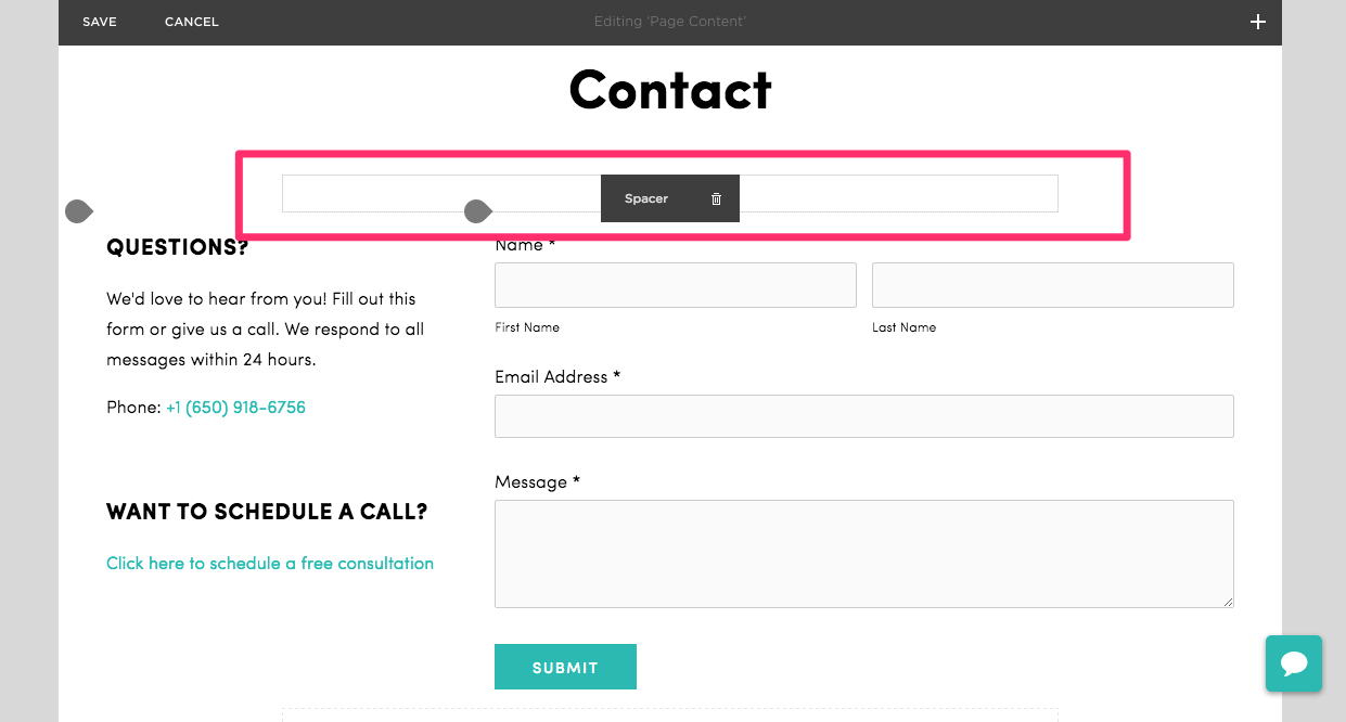
Notice how the Spacer Block was placed below the Text Block that says “Contact”. This was meant to break up the space before the Text and Form Blocks below it. For a look at the finished product, click here – you’ll need it for the next example, too.
5. FORM
What It’s For: Add a form to collect information from visitors.
Our Recommendation: Use a form in creating contact pages, conducting surveys, inviting customers to fill in sign-up forms, and the like.

BUILD IT AND THE SITE WILL COME
We hope you’ve found these past few posts helpful. If you recall our first one, we even gave homework for our readers (scroll over to the end if you haven’t seen it!). Now’s the perfect time to use that homework: practice building your own Content Blocks on a test Page using the content you made. Just get a feel of the basic ones above and tinker around with the settings first.
If you ever have concerns or questions, feel free to schedule a free consultation with us by clicking the Button Block below. Or you can even chat us up by using the chat icon on your lower right. Stay tuned for the next post in our Squarespace Beginner’s Series!